
Retoque fotográfico, diseño gráfico y diagramación.
[ESP]
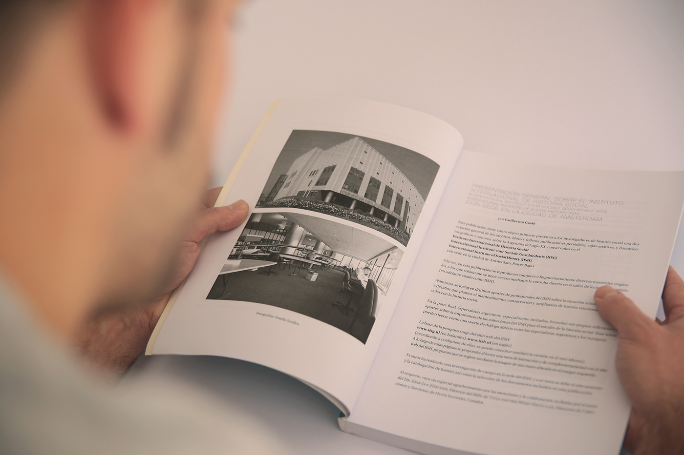
Este proyecto consistió en el retoque digital de más de 2000 imágenes, el diseño de portada y la diagramación de los 4 tomos que componen la publicación.
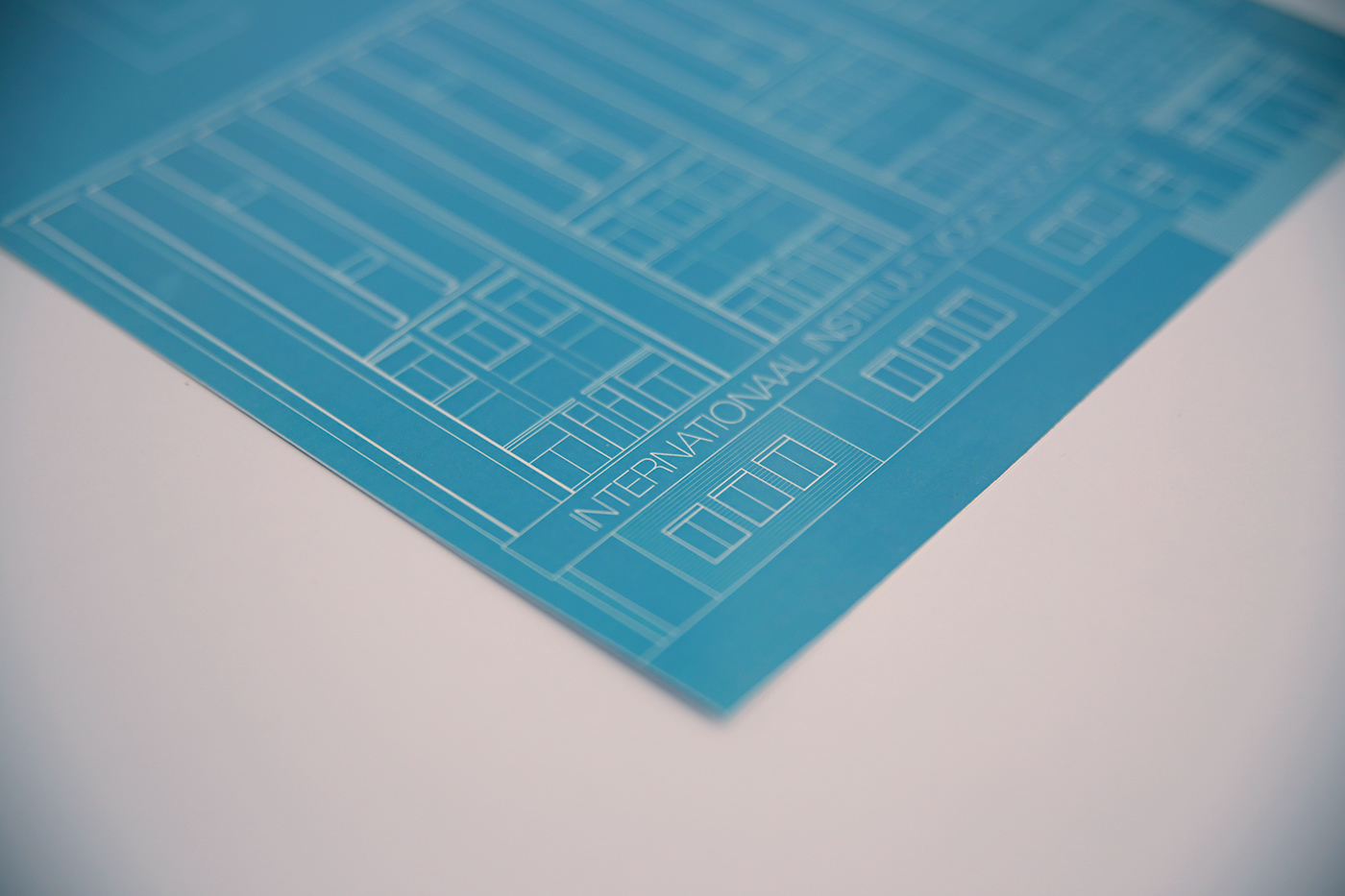
La portada: se tomó como disparador la fachada del Instituto Internacional de Historia Social de Ámsterdam como una analogía a lo que representa la tapa para una publicación. Es decir, la entrada a los contenidos. La utilización de un estilo lineal le otorgó simplicidad a una ilustración que de por sí era muy compleja, a pesar del racionalismo de la arquitectura. La cromaticidad utilizada mezcla dos cuestiones: el color identitario del Instituto y el de la bandera argentina, dada la procedencia de los documentos presentes en los libros.
Este proyecto consistió en el retoque digital de más de 2000 imágenes, el diseño de portada y la diagramación de los 4 tomos que componen la publicación.
La portada: se tomó como disparador la fachada del Instituto Internacional de Historia Social de Ámsterdam como una analogía a lo que representa la tapa para una publicación. Es decir, la entrada a los contenidos. La utilización de un estilo lineal le otorgó simplicidad a una ilustración que de por sí era muy compleja, a pesar del racionalismo de la arquitectura. La cromaticidad utilizada mezcla dos cuestiones: el color identitario del Instituto y el de la bandera argentina, dada la procedencia de los documentos presentes en los libros.
[ENG]
This project consisted in the digital edition of more than 2000 images, the cover design and the layout of the 4 volume publication.
The cover: the façade of the International Social History Institute of Amsterdam was taken as an analogy to what the cover represents for a publication: the entrance to the contents. The use of a linear style gave simplicity to an illustration that in itself was very complex, despite the rationalism of architecture. The chromaticity used mixes two issues: the identity color of the Institute and the Argentine flag, given the origin of the documents present in the books.


Fotografía: Un Barco

